
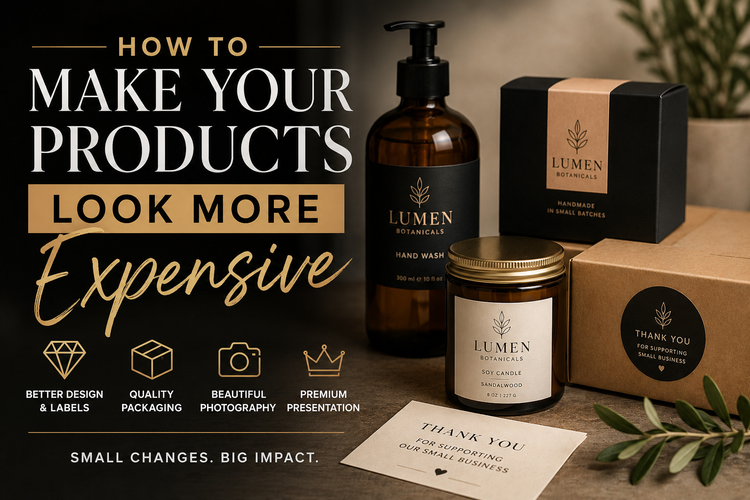
TLDR
You do not need fully custom packaging to make a product look more expensive.
Start by improving the parts customers notice first: the label, container, color palette, typography, product photography, and overall presentation. Use fewer design elements, better materials, consistent branding, and packaging that fits the product properly.
The goal is not to pretend a product is something it is not. It is to present its real quality more clearly.
There is a noticeable difference between an inexpensive product and a product that looks cheap.
An inexpensive product can still feel polished, carefully made, and worth buying. A product looks cheap when the label is crooked, the design is crowded, the container feels flimsy, or the packaging looks like it was assembled from unrelated supplies.
Learning how to make your products look more expensive is mostly about removing those signs of carelessness. Better presentation creates a stronger first impression and helps customers understand the product’s value before they use it.
And many of the best improvements are relatively small.
What Makes a Product Look Expensive?
Products tend to look more expensive when every visible detail appears intentional.
That usually includes:
- A clear visual hierarchy
- Consistent colors and typography
- Crisp printing
- Packaging that fits correctly
- Quality materials
- Simple product photography
- Clean application of labels and seals
- A restrained amount of information
- A recognizable brand identity
Premium product presentation is not about adding the most decoration possible. In many cases, it means editing the design until only the strongest elements remain.
Adobe’s packaging guidance recommends keeping layouts simple, using high-resolution artwork, maintaining consistent branding, and considering tactile finishes such as matte, gloss, lamination, and holographic materials.
A dark box with gold lettering can still look cheap if the logo is blurry. A plain kraft box can feel polished if the label is well designed, the product fits properly, and the customer experience feels considered.
Improve the Product Label First
For many products, the label carries most of the visual identity.
A customer may not know what kind of box you used or how much the container cost. But they will notice if the label is difficult to read, badly aligned, or printed from a low-resolution file.
A better label can improve the appearance of:
- Candles
- Jars
- Bottles
- Coffee bags
- Soap
- Cosmetics
- Food packaging
- Apparel bags
- Art prints
- Handmade goods
- Subscription products
- Gift boxes
The label should make four things clear:
- Who made the product
- What the product is
- Which variety or version it is
- What information the customer needs before buying
Everything else is secondary.
CustomStickers.com offers custom product and packaging labels in different sizes and shapes. Customers upload their artwork and receive a proof before printing, which makes it possible to review the cut, spacing, and final layout before production. The product page describes the labels as water- and oil-resistant with permanent adhesive.
A clean professional label often provides a larger visual improvement than switching to a much more expensive container.
Use Less Information on the Front
Trying to explain everything on the front of a product usually makes the design feel cheaper.
The front label does not need to include the complete company story, every feature, every ingredient, the full address, five certification icons, social media handles, and a large QR code.
Prioritize the information needed to identify and understand the product.
For example, the front of a candle might include:
- Brand name
- Scent name
- Product type
- Net weight
Warnings, care instructions, company information, and longer descriptions can go on the bottom or back.
This creates visual hierarchy. The customer sees the most important information first instead of facing a wall of similarly sized text.
White space is not wasted space. It makes the remaining elements easier to notice.
Choose One Strong Typeface
Typography has a large effect on perceived quality.
Products often look less polished when their packaging combines several unrelated fonts. A script logo, condensed product name, serif description, bold sans-serif ingredients list, and handwritten slogan may all compete for attention.
Most small brands only need:
- One distinctive brand typeface
- One simple supporting typeface
The supporting font should be easy to read at small sizes. It can handle product details, ingredients, instructions, weights, and contact information.
Use bold, regular, and light weights to create hierarchy instead of adding more font families.
And be careful with overly decorative fonts. A typeface that looks good in a large logo may become unreadable when used for a scent name or product description.
Limit the Color Palette
A limited color palette usually feels more controlled than a design using every available color.
Start with:
- One primary brand color
- One neutral color
- One supporting accent
You can introduce additional colors for product varieties, but they should still feel connected to the main brand.
For example, a skincare line might use the same cream background and black typography on every label, then use one muted accent color to distinguish each formula.
That gives customers a quick way to recognize the product range without making every item look unrelated.
Dark colors, cream tones, muted shades, black, white, and metallic accents are often associated with premium packaging. But they are not required. Bright colors can also feel high-end when they are used consistently and printed well.
The key is control, not darkness.
Choose Packaging That Fits the Product
Oversized boxes, loose containers, and poorly fitted inserts can make a product feel less valuable.
A customer notices when a small object arrives rattling around inside a large box. It can make the item seem smaller than expected and suggest that the packaging process was not carefully planned.
Choose packaging based on the product’s:
- Size
- Weight
- Shape
- Fragility
- Storage requirements
- Shipping method
- Expected shelf life
A fitted paper sleeve can look better than a large decorative box. A small rigid mailer may feel more appropriate than a soft bag. A simple glass jar can present some products better than a complicated plastic container.
The packaging should also protect the product. A beautiful box does not create a premium experience if the item arrives scratched, crushed, or leaking.
Upgrade Plain Packaging With Stickers
Fully printed boxes can be expensive, especially when a business needs several sizes or changes designs frequently.
Plain boxes, bags, mailers, and tissue paper can still look branded when they use a consistent sticker system.
A small business might use:
- A logo sticker on the outside of the package
- A branded seal on tissue paper
- A product label on the container
- A thank-you sticker inside the box
- A separate promotional sticker the customer can keep
CustomStickers.com recommends packaging stickers for uses such as sealing tissue paper, branding plain shipping boxes, adding thank-you messages, labeling bundles, sharing care instructions, and marking limited editions. The company also notes that this approach lets businesses improve presentation without ordering custom-printed packaging for every size.
You can order custom stickers for branded packaging and apply the same visual identity across boxes, bags, product wraps, and order inserts.
The result feels coordinated without forcing the business to store large quantities of specialized packaging.
Pick the Right Label Finish
Finish changes how customers see and handle a product.
Matte Labels
Matte labels have lower glare and a softer appearance. They work well for:
- Skincare
- Candles
- Coffee
- Handmade soap
- Minimalist brands
- Natural products
- Black-and-white designs
- Muted color palettes
A matte finish can make a simple label feel calm and deliberate.
Gloss Labels
Gloss labels reflect more light and can make colors appear brighter. They are useful for:
- Beverages
- Sauces
- Candy
- Children’s products
- Bright cosmetics
- Colorful illustrations
- Products exposed to moisture or handling
Gloss works best when the brand is meant to feel energetic, bold, or highly polished.
Clear Labels
Clear labels allow the container or product color to show through. They can produce a printed-on appearance when used on glass, clear plastic, metal, or smooth containers.
This format works well for products where the contents are visually appealing.
CustomStickers.com offers roll and sheet labels in multiple shapes, along with matte, gloss, and clear options. The label materials are intended for product packaging, branding, organization, and repeated application.
Before choosing clear labels, test the design on the actual container. Light colors may disappear against transparent liquids or dark backgrounds unless white ink is used beneath them.
Add One Special Detail
Premium presentation often comes from one memorable detail, not ten decorative features.
That detail could be:
- A holographic seal
- A textured paper band
- A custom-shaped label
- A numbered batch sticker
- A small ribbon
- A wax-style seal sticker
- A handwritten note
- A reusable pouch
- A color-matched insert
- A free illustrated sticker
Choose one detail that supports the product.
A specialty finish can draw attention to a logo or limited-edition mark. But covering every surface with metallic accents, patterns, ribbons, and decorative inserts can make the package feel busy.
Use special materials as an accent. They are more noticeable when the rest of the presentation is restrained.
Make Product Variants Look Related
A product line looks more established when customers can immediately see that every item belongs to the same brand.
Keep these features consistent:
- Logo placement
- Label shape
- Font system
- Information order
- Photography style
- Packaging dimensions
- Background color
- Product naming structure
Then change one or two elements to identify each variation.
For example, a hot sauce brand could use the same black label, white logo, and type layout across every bottle. The pepper illustration and accent color could change by heat level.
This system looks more professional than designing each product from scratch.
It also makes future products easier to launch because the basic design rules already exist.
Improve the Product Photography
A well-packaged product can still look inexpensive in poor photographs.
Customers shopping online cannot hold the item. Photography becomes part of the product presentation.
Use:
- Clean backgrounds
- Soft, even lighting
- Sharp focus
- Accurate color
- Consistent image dimensions
- Several useful viewing angles
- Close-ups of materials and details
- At least one image showing scale
Avoid placing too many props around the product. Props should provide context, not compete with the item being sold.
For example, a candle photograph may include a small amount of greenery or a box of matches. It probably does not need six books, fabric, flowers, crystals, coffee, fruit, and decorative lights surrounding it.
Show the product clearly first. Style comes second.
Keep Packaging Clean and Straight
Small application errors can undo good design.
Before shipping or displaying a product, check for:
- Crooked labels
- Wrinkled tissue paper
- Fingerprints on glass
- Dust under clear packaging
- Loose threads
- Scratched containers
- Uneven seals
- Dented boxes
- Adhesive residue
- Labels placed at different heights
Create a simple placement guide for whoever applies the labels.
You might specify that every front label begins one inch above the base of the container and lines up with a particular seam. A small cardboard positioning jig can help workers place labels at a consistent height.
These details are easy to overlook during a busy packing day. Customers still see them.
Make the Unboxing Process Feel Ordered
An expensive-looking product usually arrives in a logical sequence.
The customer opens the outer package, sees the brand, removes the protective layer, and finds the product presented cleanly.
The package does not need to become a complicated performance. It just needs to feel organized.
A simple unboxing sequence might be:
- Branded shipping box or mailer
- Neatly folded tissue paper
- Small logo seal
- Product placed securely inside
- Short thank-you or care card
- Optional free sticker
Put practical information where the customer needs it. Care instructions should be easy to find. Fragile components should be protected. Product names should face upward when possible.
Good packaging makes the order feel easier to understand.
Avoid Fake Premium Language
Calling a product “luxury,” “elite,” or “exclusive” does not make it look more valuable.
Those words can have the opposite effect when the packaging or product does not support them.
Use specific language instead.
Rather than saying:
- Premium quality candle
Say:
- Hand-poured soy candle with a cotton wick
Rather than saying:
- Luxury handmade soap
Say:
- Small-batch soap made with shea butter and olive oil
Specific information helps the customer understand what they are paying for.
Premium positioning should come from the product, materials, design, and customer experience. It should not depend on adjectives.
Do Not Hide a Weak Product Behind Packaging
Presentation can help customers notice real value. It cannot permanently replace it.
A beautiful label will not fix:
- Poor materials
- Inconsistent sizing
- Weak construction
- Unpleasant fragrance
- Bad flavor
- Short product life
- Leaking containers
- Unreliable performance
The package makes a promise about what is inside. The product has to keep that promise.
Start by improving the product itself. Then make sure the presentation reflects that level of quality.
A Low-Cost Premium Packaging Plan
Small businesses can make meaningful improvements without replacing everything at once.
| Priority | Improvement | Why It Matters |
|---|---|---|
| 1 | Redesign the main product label | It is often the most visible brand element |
| 2 | Standardize fonts and colors | Creates consistency across the product line |
| 3 | Improve label placement | Removes an immediate sign of rushed production |
| 4 | Use packaging that fits | Makes the product feel properly sized and protected |
| 5 | Add a branded seal | Upgrades plain boxes, tissue, and bags |
| 6 | Improve product photos | Raises perceived quality online |
| 7 | Add one special detail | Creates a memorable finish without clutter |
| 8 | Review the complete unboxing process | Makes the customer experience feel intentional |
Begin with the first three items. They usually produce the fastest visible improvement.
Final Thoughts
You do not make a product look more expensive by adding more decorations. You do it by making every visible choice feel deliberate.
Begin with the label. Improve the typography, simplify the information, and use a consistent color system. Choose packaging that fits the item, apply labels carefully, and photograph the product clearly.
Then add one memorable detail.
Businesses can use custom labels and stickers to create a consistent look across products, boxes, bags, and customer orders. This can improve product presentation without the cost or storage requirements of fully custom packaging.
The product should still earn the price through its quality. Good presentation simply helps customers see that value sooner.