
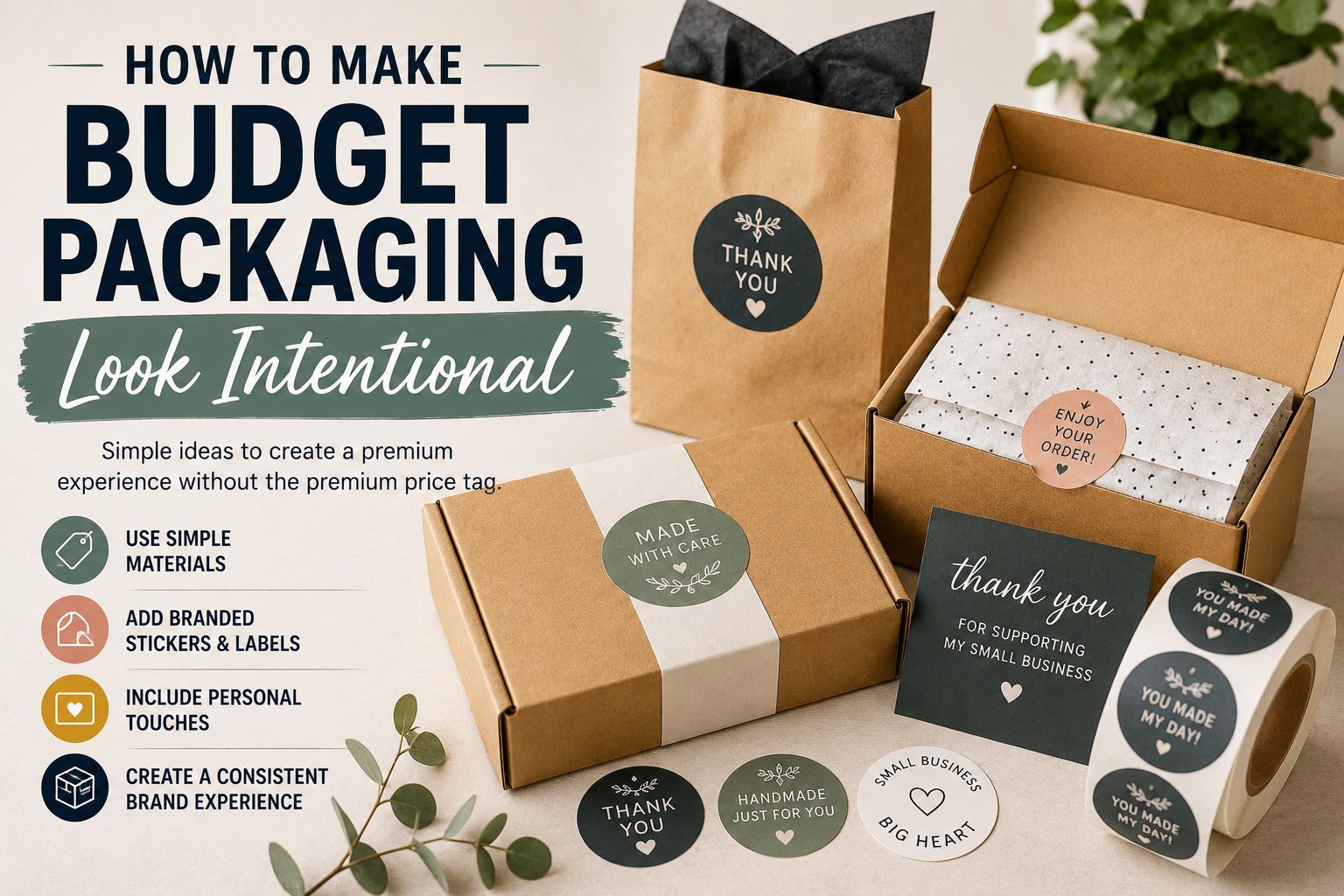
TLDR
- Budget packaging looks better when every detail feels chosen, not random.
- Start with one color palette, one sticker style, and one repeatable packing method.
- Plain boxes, kraft mailers, paper bags, and tissue can look polished with the right labels, seals, and inserts.
- Spend money on the visible details customers notice first.
- The goal is not expensive packaging. The goal is packaging that feels consistent, clean, and easy to recognize.
Budget packaging does not have to look cheap. It usually looks cheap when it feels rushed, mismatched, or unfinished.
A plain kraft box can look thoughtful. A simple mailer can feel branded. A basic paper bag can look clean and retail-ready. The difference is not always the material. It is the way the pieces are put together. When the colors, stickers, labels, folds, inserts, and finishing details all feel connected, budget packaging starts to look intentional.
Start With One Clear Packaging Style
Before buying supplies, choose one simple packaging style. This keeps your packaging from turning into a drawer full of unrelated ribbons, mailers, bags, stickers, and tissue paper.
A clear style might be:
- Minimal and clean
- Warm and handmade
- Bright and playful
- Natural and earthy
- Bold and graphic
- Soft and giftable
Once you choose a direction, every packaging decision gets easier. A natural skincare brand might use kraft boxes, cream tissue, soft green labels, and simple black text. A sticker shop might use white mailers, colorful seals, and a small branded insert. A bakery might use clear bags, printed labels, and a simple box sticker.
The style does not need to be complicated. It just needs to be consistent.
Use Plain Packaging as the Base
Plain packaging is often the best place to start because it is flexible and easy to brand. Kraft boxes, white mailers, glassine bags, clear sleeves, paper bags, and basic shipping boxes can all look good when they are used with care.
The mistake is treating plain packaging like an afterthought. A blank box with nothing on it may feel unfinished. The same box with a centered label, clean tissue, and a small thank-you card can feel like part of a real brand.
Good budget bases include:
| Packaging Item | Why It Works |
|---|---|
| Kraft mailers | Warm, simple, and easy to brand |
| White boxes | Clean and flexible for many brands |
| Clear sleeves | Good for prints, cards, and small goods |
| Paper bags | Useful for markets and retail pickups |
| Tissue paper | Adds a finished layer without much cost |
| Product labels | Makes jars, bottles, bags, and boxes feel complete |
Start simple. Then add branded details where they matter most.
Pick a Small Color Palette
Too many colors can make budget packaging look scattered. A small color palette makes basic supplies feel more planned.
Choose:
- One main brand color
- One neutral color
- One accent color
For example:
| Brand Feel | Main Color | Neutral | Accent |
|---|---|---|---|
| Natural | Forest green | Kraft brown | Cream |
| Modern | Navy | White | Yellow |
| Playful | Coral | White | Teal |
| Handmade | Rust | Kraft | Soft pink |
| Minimal | Black | White | Gray |
Use the same colors across stickers, labels, inserts, tissue, and product photos. This helps customers recognize your brand even when the packaging materials are simple.
A color system also saves money because you stop buying random supplies that only work once.
Add One Strong Branded Sticker
One well-placed sticker can do a lot. It can seal tissue paper, close a box, label a bag, or turn a plain mailer into branded packaging.
That is why stickers are one of the easiest upgrades for budget packaging. They are flexible, practical, and visible right away. A simple logo sticker on the outside of a mailer can make the order feel more official. A thank-you sticker on tissue paper can make the unboxing feel more personal.
For product packaging, custom label and packaging stickers are useful because they can add branding, product names, ingredients, scent names, care notes, or simple design details to basic packaging.
Placement matters. A sticker slapped in a random corner may not help much. A centered sticker, a seal over a fold, or a label aligned with the edge of a bag looks more intentional.
Make the Sticker Shape Part of the Design
The shape of your sticker changes the feel of the package.
Circle stickers are great for seals, jars, candles, bags, and simple logos. Rectangles work well for product labels, boxes, and ingredients. Die cut stickers feel more custom and work well for mascots, illustrated logos, and creative brands.
For example:
| Sticker Shape | Best Use |
|---|---|
| Circle | Seals, jars, thank-you stickers, simple logos |
| Rectangle | Product labels, box labels, ingredient labels |
| Oval | Boutique packaging, candles, food products |
| Square | Modern logos, QR code cards, small packages |
| Die cut | Mascots, illustrations, artist brands, merch |
If your packaging is very simple, a custom shape can add personality without adding more materials. Die cut stickers are a good fit when you want the sticker itself to feel like a designed object, not just a label.
Create a Repeatable Packing Method
Intentional packaging is not only about how it looks. It is also about how consistently you can repeat it.
A simple packing method might look like this:
- Fold product in tissue.
- Seal tissue with a branded sticker.
- Add thank-you card.
- Place product inside box or mailer.
- Add protective fill if needed.
- Close package.
- Add outside label or logo sticker.
The exact steps depend on your product, but the idea is the same. Create a process you can repeat on a busy day.
This matters because budget packaging often falls apart when orders increase. The first five packages look cute. By order 47, everything starts looking different because there was no system.
Keep the process simple enough that you can repeat it 100 times.
Spend on the Parts Customers Notice First
If the budget is tight, do not spend evenly across every detail. Spend where customers notice.
Most customers notice:
- The outside of the package
- The first thing they see when they open it
- The product label
- The thank-you note or insert
- Any free sticker or small extra
- How neatly everything is packed
They usually do not notice the exact brand of tissue paper or whether every internal supply is custom printed.
A good budget setup could be:
| Detail | Budget-Friendly Choice |
|---|---|
| Outside packaging | Plain kraft mailer or box |
| Branding | One logo sticker or packaging label |
| Inside layer | Tissue paper or paper wrap |
| Personal touch | Small thank-you card |
| Repeat purchase cue | QR code or reorder note |
| Extra | Small sticker or sample |
This keeps the focus on the visible experience without overbuilding the package.
Use Sticker Rolls for Repeated Packaging
If you are packing more than a few orders at a time, rolls can save time. Peeling individual stickers from sheets or loose backing can get annoying fast. Not dramatic, just annoying enough to matter.
Sticker rolls work well for:
- Box seals
- Product labels
- Jar labels
- Bottle labels
- Bag labels
- Thank-you seals
- Scent, flavor, or size labels
- Batch or seasonal labels
For repeated packaging tasks, sticker rolls for small business packaging can make the process cleaner and faster. They are especially helpful when you need the same label applied to many products or packages.
Rolls also make your packing station feel more organized. Pull, apply, move on. That is the dream when you are packing orders after dinner.
Keep Product Labels Clear
A product label does not need to carry your whole brand story. It needs to help the customer understand what the product is.
A clean label usually includes:
- Brand name or logo
- Product name
- Variant, scent, flavor, or size
- Simple description, if needed
- Required details for the product category
- Website or social handle, if it fits
- Batch, care, or use information, when useful
Do not cram too much onto a small label. Tiny text can make packaging feel cluttered and harder to trust. If a product needs more information, put the main label on the front and details on the back, bottom, tag, or insert.
Good budget packaging often feels calm because it does not try to say everything at once.
Match Your Inserts to the Packaging
A thank-you card, care card, or reorder insert can make budget packaging feel more complete. But it should match the rest of the package.
Use the same colors, fonts, logo, and tone. If the outside of the box is clean and minimal, the insert should not look like a completely different brand. If the product labels are playful and colorful, the insert can share that energy.
Simple insert ideas:
| Insert Type | Best For |
|---|---|
| Thank-you card | Most ecommerce orders |
| Care card | Candles, apparel, ceramics, skincare |
| QR reorder card | Consumables and repeat-buy products |
| Review request card | Small businesses building social proof |
| Product story card | Handmade, artist, or giftable products |
One useful insert is enough. Too many inserts can make the package feel cluttered.
Use White Space on Purpose
White space is one of the easiest ways to make packaging look more expensive without spending more.
Do not fill every inch of a label, card, or box. Leave breathing room around the logo. Give product names space. Let the sticker sit cleanly on the package instead of crowding it with tape, extra labels, and too many decorative pieces.
A simple label with clear spacing often looks better than a crowded label with more design elements.
This applies to packaging photos too. When you photograph your products, show the packaging in a clean setting. A tidy photo can make the same budget packaging feel more polished online.
Add One Memorable Detail
Budget packaging does not need many extras. It needs one detail people remember.
That detail might be:
- A small bonus sticker
- A handwritten first name
- A care card with a warm note
- A bright tissue color
- A shaped sticker seal
- A QR code to a playlist or care page
- A small sample
- A seasonal label
The key is choosing something repeatable. A handwritten five-sentence note sounds nice until you have 60 orders to pack. A short handwritten name or simple “thank you” may be more realistic.
Your memorable detail should make the customer feel like the order was prepared with care, not like the package is trying too hard.
Avoid the Common Budget Packaging Mistakes
The first mistake is buying too many unrelated supplies. A pack of bright mailers, floral tissue, metallic labels, neon stickers, and kraft tags might all look good separately. Together, they can feel messy.
The second mistake is using stickers without alignment. Crooked seals and off-center labels can make decent packaging feel rushed.
The third mistake is using low-contrast labels. Pale text on kraft paper or thin white text on a light color may look pretty on screen but be hard to read in real life.
The fourth mistake is overpacking. Too much paper, too many cards, or too many decorative pieces can make the order feel wasteful or confusing.
The fifth mistake is skipping the outside of the package. The unboxing starts before the box is opened.
A Simple Budget Packaging Formula
Use this formula when you are stuck:
Plain base + consistent color + clear label + one branded sticker + one useful insert = intentional packaging.
For example:
A handmade soap brand could use kraft boxes, cream labels, green logo stickers, and a small care card.
An artist could use rigid mailers, a branded envelope seal, a backing card, and a bonus sticker.
A coffee brand could use plain bags, roast labels, a batch sticker, and a reorder QR card.
A boutique could use white mailers, tissue paper, a thank-you sticker, and a small branded card.
None of these ideas require custom boxes. They rely on consistency.
For simple branded packaging supplies, start here: https://customstickers.com/
Conclusion
Budget packaging looks intentional when it has a system. Choose a clear style, use a small color palette, start with plain packaging, and add branded details where customers will notice them.
You do not need custom boxes, expensive tissue, or complicated inserts to make a good impression. A clean label, a well-placed sticker, a neat fold, and a repeatable packing process can make simple packaging feel thoughtful.
The goal is not to hide that your packaging is budget-friendly. The goal is to make it feel chosen.
Frequently Asked Questions
How can I make cheap packaging look better?
Use plain packaging as the base, then add one or two consistent branded details. A logo sticker, clean product label, matching tissue paper, and simple thank-you card can make cheap packaging look much more intentional.
What is the easiest way to brand plain packaging?
The easiest way is to add custom stickers or labels. Use them as box seals, product labels, tissue seals, mailer stickers, or thank-you stickers.
Do I need custom boxes for my small business?
Not always. Plain boxes can look polished when paired with consistent labels, stickers, tissue, and inserts. Custom boxes can be nice later, but they are not required to create a good customer experience.
What colors work best for budget packaging?
Simple color palettes usually work best. Choose one main brand color, one neutral, and one accent color. This keeps the packaging from feeling random.
Should I include freebies in budget packaging?
A small freebie can help, but it should be affordable and easy to repeat. Stickers, samples, postcards, or discount cards can work well as long as they do not slow down packing or hurt your margins.